The mistake I keep repeating
My first mistake (and one which I constantly make) was trying to make the website look as aesthetically pleasing as possible as I went along.
I took far too much time experimenting with background colours and typefaces when I should have just concentrated on the fundamentals like links, navigation and footers. Deciding on what colour scheme to use could wait, but as a perfectionist, I wanted it to look great right from the start. I continue to fall into this trap. It seems something I can’t shake off and I often wonder how other developers manage.
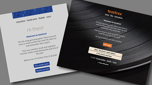
My main aim with regard to the design was to make it as simple as possible. A clean design which is easy on the eye was my objective. I researched other puzzle games and found the designs were all different. Quite a few had animated graphics but I didn’t want extra design elements distracting from the puzzle. It needed to be a calm and relaxing place where you can spend time thinking, without any bouncing emojis, flashing banners or garish colours. Having said that, I have experimented with a confetti graphic for when a player answers correctly.
Decades of colour
One of the biggest design challenges I had was to develop a colour palette which would distinguish between the decades. A quick look at fashions and colour styles from the past proved useless as each decade had various colours which didn’t work alongside the colours of other decades. The 1980s for example, had bright hues with hot pinks, neon yellows and electric blues. A far cry from the chocolate browns and warm creams of the late 1960s.
In the end I decided to simply choose a palette of colours which complemented one another and incorporate the decade names like “90s” as subtle background graphics so that players could visually tell which decade they were playing.
Another area of design which I can’t seem to stop tinkering with is typography. I prefer the look of a sans serif typeface as, to me, it goes well with the music theme. However, the huge array of typefaces available makes it extremely difficult to choose just one. An early favourite of mine was Trebuchet MS which I used throughout the ‘tezztrax’ initial design. It all looked perfect in the recommended default font size of 16px, until I remembered that the site had to be responsive and work on mobiles too. A quick check in ‘Responsive Design Mode’ in Safari highlighted a big problem. My navigation was all over the place with links dropping to new lines and headings messing up whole pages.
In the end I found a typeface on Google Fonts called ‘Dosis’ which doesn’t take up as much space as a lot of other typefaces:
Typeface size example at 20px (Dosis)
Typeface size example at 20px (Trebuchet MS)
As you can see, Trebuchet MS takes up much more space than Dosis at the same font size.
Of course, by the time you read this I will probably have changed my mind again and selected a completely different typeface altogether! I find that experimenting is half the fun and trying new ideas to improve the site can never be a bad thing. Can it? All this still doesn’t stop me experimenting though, so if you play regularly, you might see the odd style change here and there. For which, I apologise. I just can’t help it!